


I want to highlight in a quick post a campaign that has recently caught my eye. Interestingly, it got my attention not with a ground-breaking creative idea, high-production values, or a game-changing shift in strategy, but with the absence of all of those things. This campaign stood out due to its no-frills, to-the-point simplicity, so much so that it may even make you smile. And the funny thing is, this approach nailed what is fundamentally at the heart of the brand. That brand, is No Name.
Re-launched last year as Loblaw's recessionary hero, No Name's return was perfectly-timed: frugal shoppers were already beginning to train themselves to be on the lookout for value, which included trading down to private label products. In the throes of the recession, the stigma of pushing around a cart full of store brands had disappeared - frugal shopping was simply smart shopping. The ad that re-launched No Name featured Loblaw's Galen Weston Jr. touting the amount of money savvy shoppers would save by opting for No Name products over their national brand counterparts.

What's interesting is that private labels have begun to latch on to a category-wide, value-driven source of equity. This means that they now have a kind of "badge-value", a means of expressing that you are a smart and frugal shopper. But there's a problem: over the last few years, store brands have been attempting to look just like their national brand competitors. Check out the examples below - can you spot the store brands?
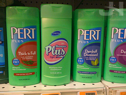
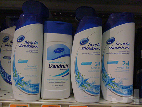
Even No Name brand products were beginning to look more and more like a national brand, adding packaging elements like photos and adding extra copy. As a result, they were harder to find and lost a bit of the iconic simplicity that made them stand out. With the relaunch, Loblaw's has gone back to basics, stripping out the extra bells and whistles and returning the brand to all of its no frills glory.
"[Loblaw] was looking to get back to [a message conveying] no gimmicks, no fakery - just high-quality products at the lowest price possible." - David Rosenberg, Creative Director at Loblaw's AOR Bensimon Byrne.

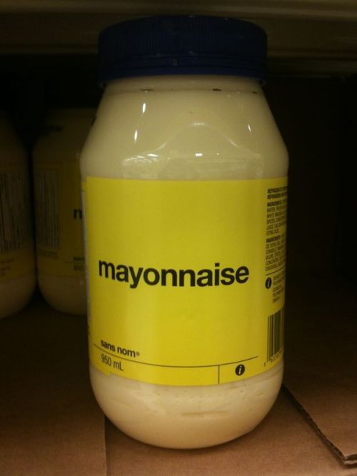
No Name's packaging: back to basics.
A series of new TV spots celebrates the brand's simplicity:
As a result of No Name's return to back-to-basics branding, both the products and the ads have become much more iconic, more distinctive, and in an age in which thrift is in, the ultimate anti-brand.
Read more about No Name's approach in this article from The National Post.

No comments:
Post a Comment